

Most teams using Diffy compare their production site with a staging or development environment before a release. Diffy screenshots the same pages on both and highlights what’s different. Then someone on the team goes through the differences and marks each one as a bug, an expected change or a false positive. Most are expected, because that’s the point of a release: new copy, a redesigned section, a new page. We got curious about the rest, the ones teams marked as bugs.
We picked 100 of them, all from live websites. The sites belong to universities, government agencies, nonprofits, manufacturers and agencies’ clients, in North America and Europe. We put each bug into a category and counted.
When people imagine a broken website, they picture an error page. We found two. Most of the other 98 were much quieter: a button that moved, a heading that vanished, a font that didn’t load. The kind of thing that passes every automated test because, technically, nothing failed.
What we found
A third of the bugs were layout shifts. Add the missing elements and you’re at 57 of 100. We ended up with exactly 100 cases, so the percentages are also the counts.
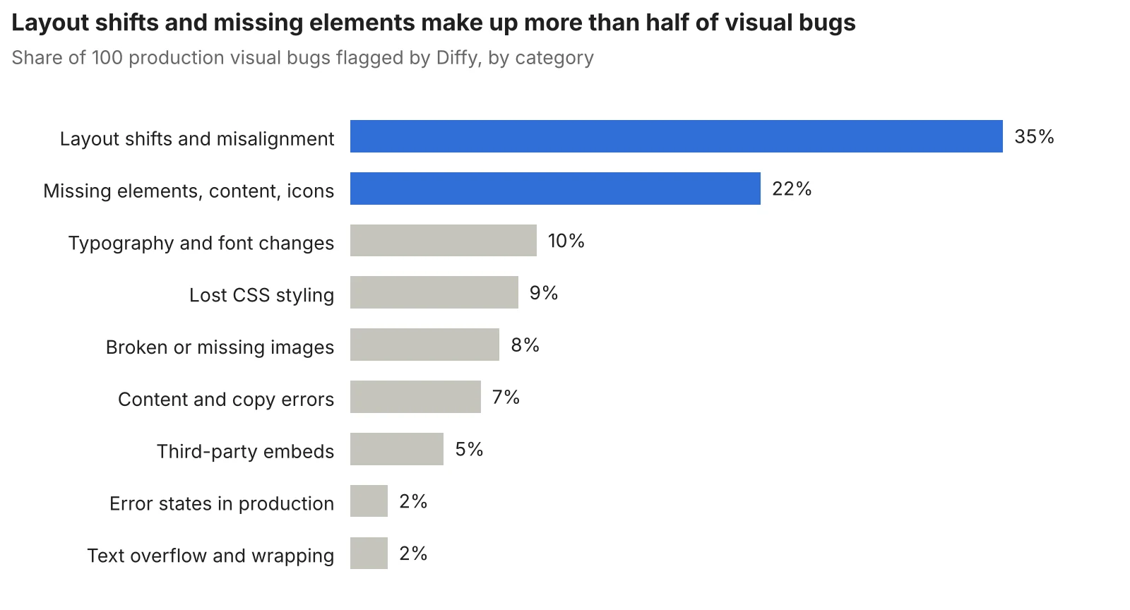
The two biggest groups are the hardest to notice. The page works. It just looks a bit off, or something is missing that nobody remembers was there.
Below are examples from each category. In every screenshot the left side is Diffy’s view, with changed areas marked in red, and the right side is the same page on the other environment.
Layout shifts and misalignment (35 bugs)
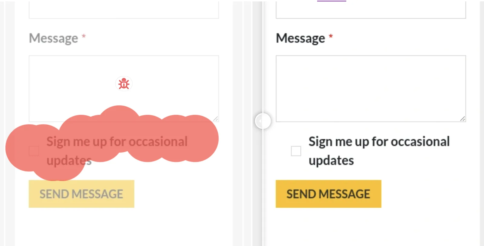
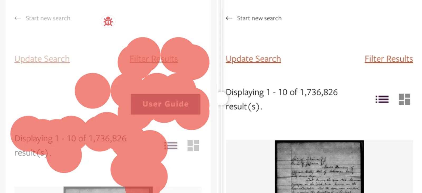
This was the biggest group by far. The element is still there and still clickable, it’s just in the wrong place. A functional test checks that a button exists and works. It doesn’t care whether the button is where the designer put it.
Some of these were a few pixels of extra padding. Others were impossible to miss once you saw them.

Missing elements and content (22 bugs)
Things that should be on the page but aren’t. Headings, whole sections, cards, little icons. There’s no error because nothing broke in a way the server notices. The template simply stopped printing it.
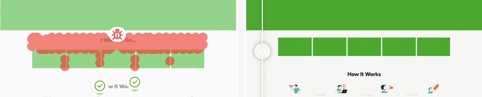
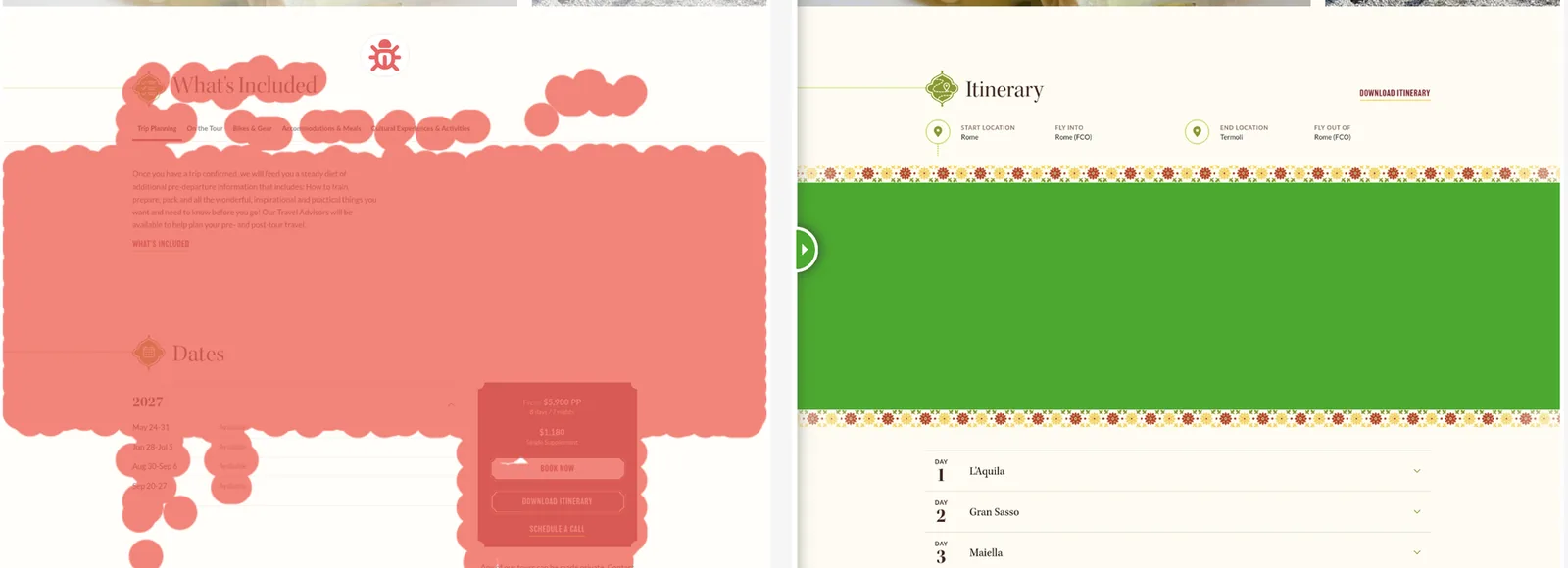

The next one worried us more than the others. The privacy consent text under a contact form’s checkbox disappeared. Visitors could still tick the box. They just couldn’t see what they were agreeing to, and under GDPR that can be a legal problem as well as a design one.

Typography and fonts (10 bugs)
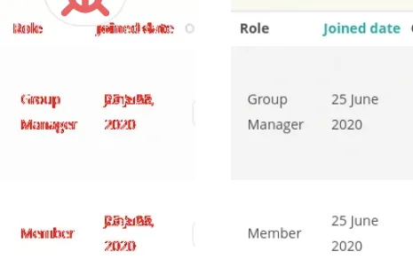
Most font problems were mild. A font loads late or falls back to another one, the text gets a little wider, and every line below it rewraps. Annoying, rarely fatal.
Then there was this admin table:
Lost CSS styling (9 bugs)
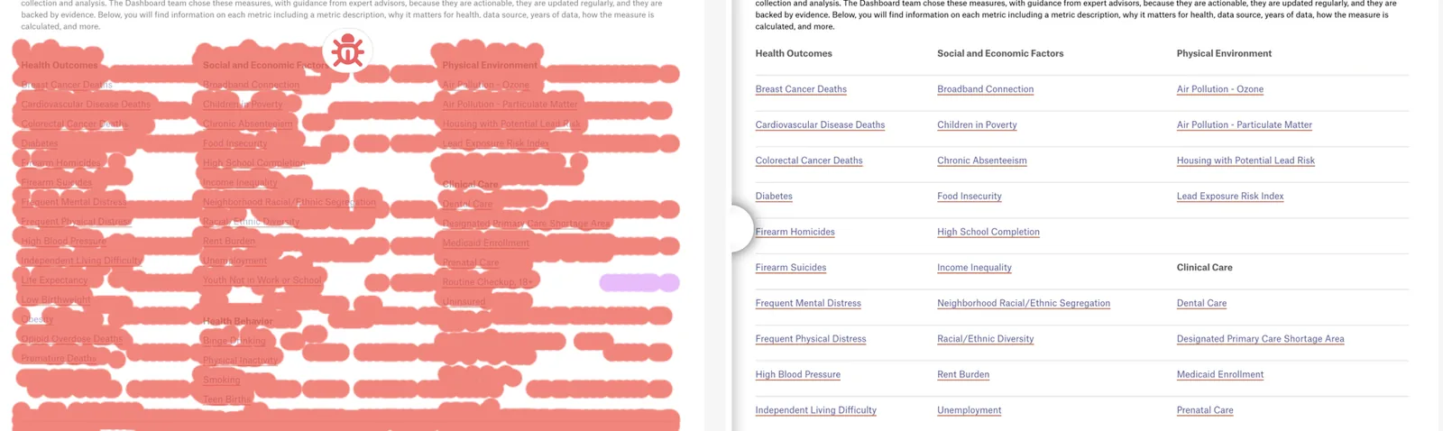
A stylesheet, or a single rule in it, stops applying. Buttons go back to browser defaults, lists lose their spacing. The worst one we saw was a US federal agency page that lost its whole stylesheet and showed up as a plain bulleted list of links, like it was 1996.

Broken images (8 bugs)
The usual suspects: a file moved, a path changed, an image got deleted. What visitors see depends on the browser, an empty frame, a broken-image icon, or the alt text sitting where the picture should be. We saw that last one twice.
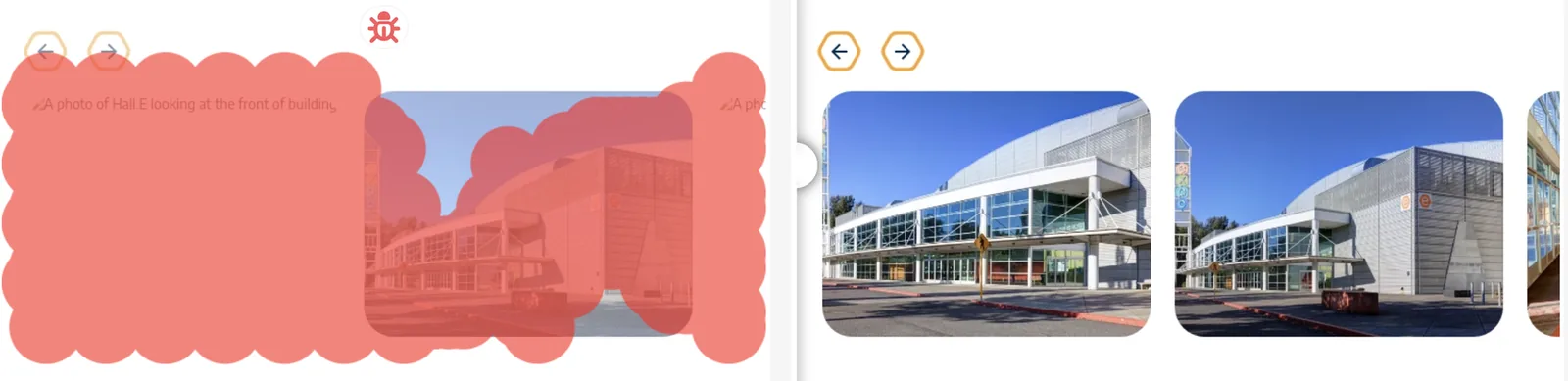
One carousel had broken images on both environments, production included. In other words, it was already broken on the live site. Nobody had noticed.
Content and copy mistakes (7 bugs)
Here the layout was fine and the words were wrong. A form with two “First Name” fields where the second one should have said “Last Name”. A copyright year that changed in one version and not the other. A share price chart in French on the English page.
And our favourite:

Third-party embeds (5 bugs)
Forms, CAPTCHAs and video players usually come from someone else’s script. If that script fails, or a plugin update changes how it’s loaded, your page renders fine around a hole. We saw a CAPTCHA label with nothing under it, a video that lost its poster image, and this:

[hubspot type=form portal=…] shortcode instead. We blurred the account ID.Error pages (2 bugs)
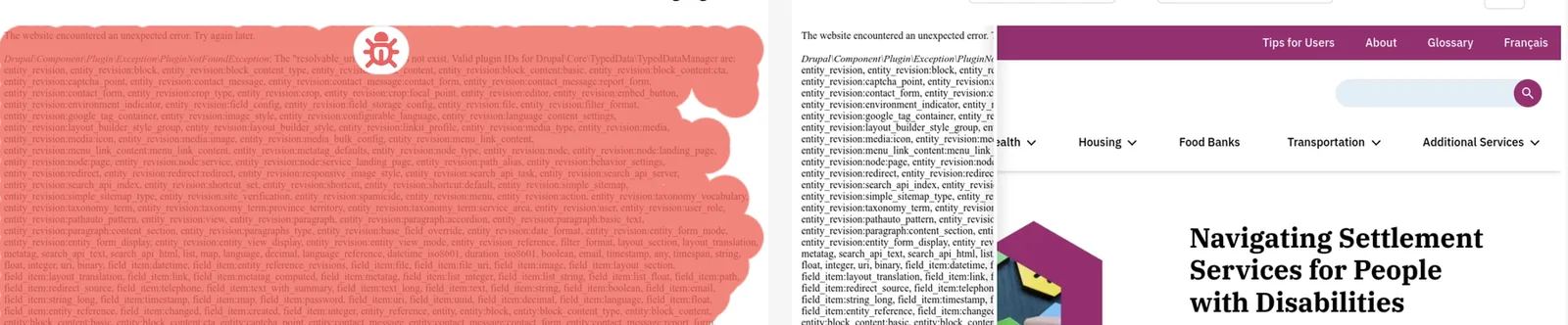
Only two in the whole set. One was a search error message sitting above a homepage hero. The other replaced an entire content page with this:
Text that doesn’t fit (2 bugs)
Columns get narrower, the text doesn’t. Numbers run into each other, or a list item wraps and leaves one word hanging on its own line.

A few things that stood out
Forms came up again and again. 10 of the 100 bugs were on a form: the missing consent text, the duplicate “First Name”, a donation form whose labels jumped next to the fields, a newsletter button that lost its style. These are the pages that bring in leads and donations, so a small visual bug there costs more than one on an About page.
Shared components spread bugs. We found the same broken tab bar on two pages of one manufacturer’s site, and the same failed font on two pages of another site. When someone changes a header or a button style, it changes everywhere that component is used, including pages nobody thinks to check after the release.
Some bugs had been live for a while. The carousel with broken images on both environments is the clearest example. A comparison between staging and production only shows what’s different, so a bug that’s on both looks perfectly normal.
And the most common bugs are the easiest to miss. A heading that moved down a few pixels doesn’t jump out when you scroll through a page after a deploy. A screenshot comparison shows it every time. Deciding whether it’s a bug is still up to a person, and that’s exactly how every bug in this post was found.
What we’d do about it
Almost all of these shipped past whatever testing the team had in place. If we had to pick a short list of habits that would have caught most of them:
- Compare staging with production before every release. A page can return 200 and still be missing its hero.
- Put your forms on that list every time: contact, sign-up, donation, checkout. Check the consent text too.
- When a shared component changes, look at a few pages from every template that uses it, not just the one you edited.
- Check at least one mobile width. Some of the overlaps we saw only happened on a phone-sized screen. We wrote more about responsive design testing separately.
- Keep an eye on embedded forms, CAPTCHAs and videos. They can break without anyone on your team touching anything.
- Before launch, search your templates for placeholder text like “lorem ipsum” or “headline here”.
- Every now and then, look at the screenshots themselves, not just the diff. A bug that’s already live won’t show up as a difference.
How we counted
The 100 bugs come from differences on live websites in 2026 that each site’s own team reviewed in Diffy and marked as a bug. Differences marked as expected changes or false positives were left out. We counted one bug per page, so if the same problem showed up again in a later run on the same page, it counted once. Each bug went into the one category that best describes what a visitor would see. A font failure that makes text unreadable counts as typography, for example, not as missing content.
Trying it on your own site
Every screenshot in this post came out of Diffy. It captures the same pages on production and on your staging or development site, highlights what’s different and lets your team mark each change as a bug, expected or a false positive. It also recognises vertical shifts, so one moved header doesn’t light up the whole page in red.
The free plan gives you 500 screenshots a month, no credit card needed.
Related reading: What is visual regression testing? · What breaks during WordPress and Drupal updates · Screenshot testing: how to get reliable results · How to avoid false positives